I really like the updated look. I like the style of the sans-serif font and the crossing stripes on the side.
Also looks like they have added some wall wraps to the concourse.
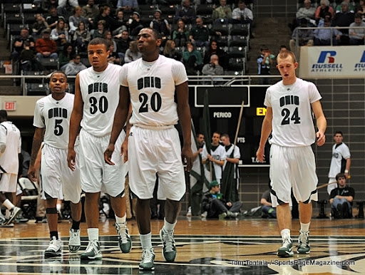
Hopefully the home whites won't have the black outline around the arched Ohio because you can't read the name on the front.